Clustering in Machine Learning
Introduction
For an attentive audience, it is known that Machine Learning provides (broadly) for clustering , classification , and regression applications. In this module, we shall discover clustering, which is a form of unsupervised learning. For a fledged version of this tutorial, visit this page .
Unsupervised Learning
In crude terms, unsupervised learning means learning from scratch. Imagine a dump of unstructured data, with absolutely no clues of direction and symmetry. Although, the attributes of the data are known, it has been randomly spewed over an assembly. Intuitively, the first task is to sift the like ones together. It makes sense. We want to have similar data points together such that the member elements of these cohorts are closer in resemblance as compared to non-members. This is the essence of clustering.
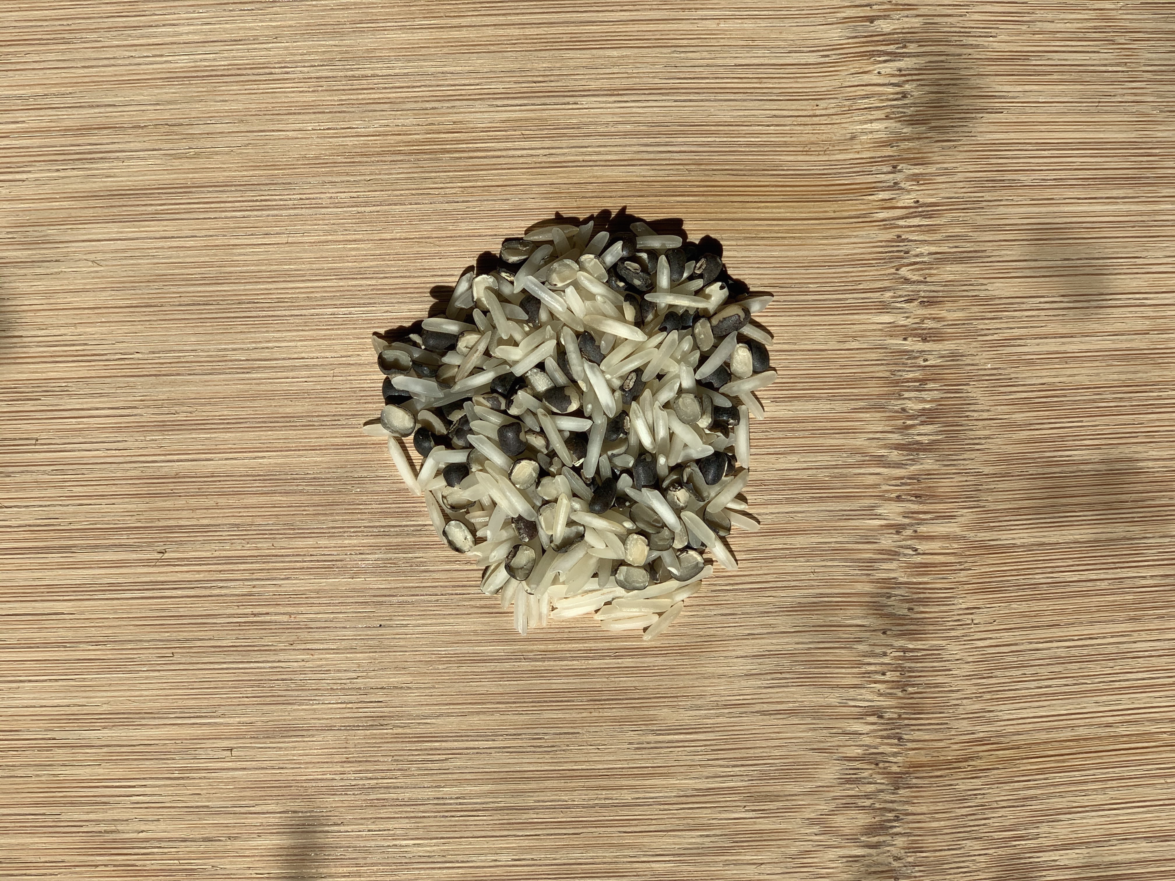
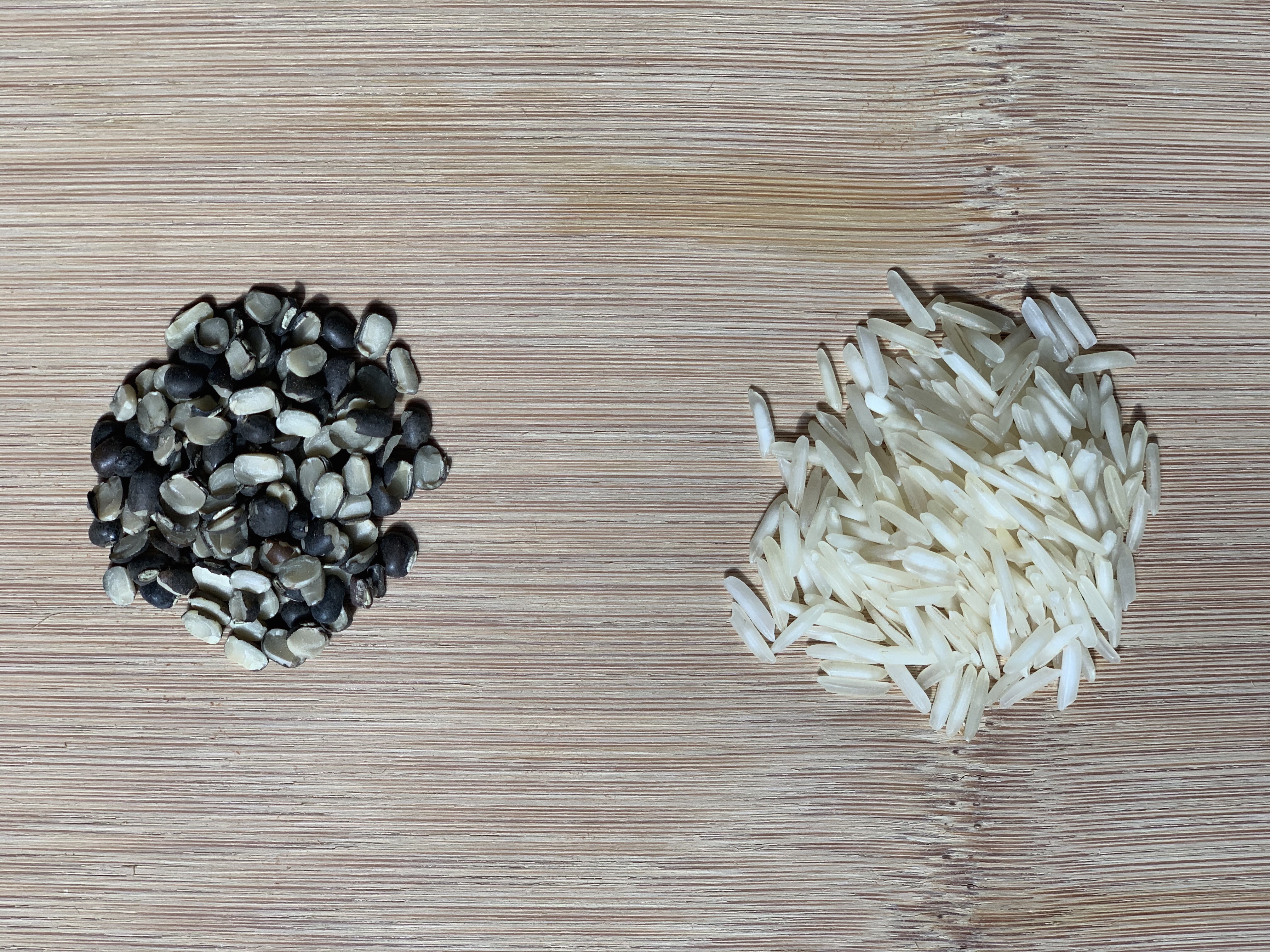
In India, a dish called Khichdi is fairly popular in the northern provinces. It is basically a mix of lentil and rice, served with yogurt and ghee (fat derived from milk). When it came for an intuition, I couldn't resist the urge to make a mention. If Khichdi could be deemed as a raw abundance of data, the individual clumps of lentil and rice are two distinct clusters of this data. This is information; information as in processed data. For establishing these clusters, we're choosing grains on the basis of their physical properties (color, shape, etc.). With experimental data, we shall adopt mathematical techniques that help underline these groupings.
|
|
|
|---|
Clustering aims to elucidate covert patterns in the unlabelled data and pull the alike closer into a cluster. Such clusters could be formed with the choice of certain similarity measures . There are several options available for such measures that we'll discuss hereafter.
Clustering Algorithms
First things first. It is important to base your choice of algorithm on the scale of data at hand. It is common to have millions of data points you'd be working with and a typical algorithm shall compare each datum to the other. This engenders a runtime of O(n) 2 in complexity notation, obviously bringing in heft to processing and turnaround time. (Note: A clustering method called k-means has a runtime complexity of O(n), meaning thereby that it scales linearly with n data points. This is comparatively efficient and we'll discuss that in a while.) There is an array of clustering methods and each one has a master application [1], albeit, we shall focus on the following categories; gists of their definitions follow.
- Centroid-based
- Density-based
- Distribution-based
- Hierarchical
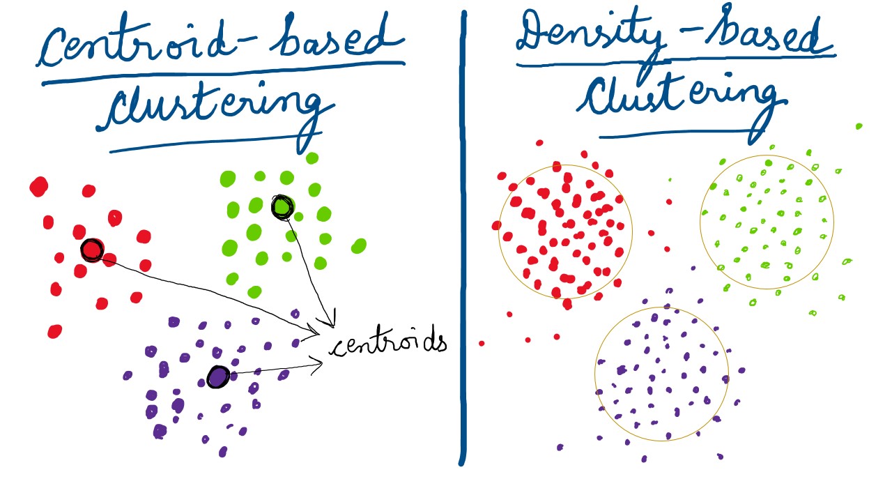
Centroid-based Clustering
With a allusion to k-means in the previous paraphrase, it falls under this type of clustering technique. A centroid is purprotedly the epicenter of the data isolates. It is a score that is central to a cluster and holds the other members with it's weight and "gravity"; like the Sun in our solar system. (Note: A centroid might not necessarily be an actual data-point.)
Density-based Clustering
Density-based clusters are vicinal regions of high-density , that are separated by objects of low-density. Basically, the overall data profile is assumed to have dense-regions(clusters) and sparse-regions(noise). Also, other algorithms work well with clusters having a regular,geometric shape; eg. circle, oval, etc. It is a distinct possibility that the real-world data isn't "pretty" enough. That is the starting point of methods like DBSCAN, that handle non-convex groupings and outliers/ noise relatively well. Density-Based Spatial Clustering and Application with Noise (DBSCAN)(Ester et al. 1996) is one such algorithm that we'll be implementing later in this tutorial. The graphic below shows convexed dense-cohorts for illustration, but you get the idea.
Distribution-based Clustering
As the name suggests, distribution-based clustering is implemented by bringing together in a cluster, those elements that align to properties of a statistical data distribution, eg. Normal (Gaussian), Chi-Squared, etc. The most popular algorithm in this type of technique is Expectation-Maximization (EM) clustering using Gaussian Mixture Models (GMM) .
Hierarchical Clustering
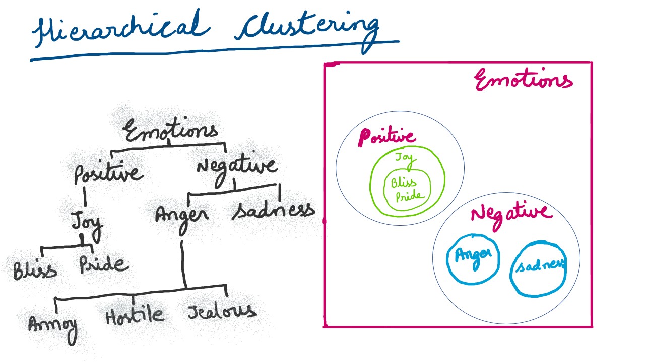
This type of clustering underlines clusters being part of other (super) clusters . The graphic below depicts the same idea. In data analysis, a common pratice is to create a dendogram to represent hierarchical clusters.
Also rudimentarily, there are a couple of distance measures that are generally employed to ascertain relative separation of clusters and member elements within a cluster. These are euclidean and manhattan distances. A euclidean distance, is essentially the square root of the summation of squared differences between the coordinates between two points. Generally found applications use euclidean distance as a clustering measure.
Data
For the current session, we shall employ the acclaimed iris dataset . Let us upload the following data to a novel Galaxy session.
- https://zenodo.org/record/3813447/files/iris.csv
- https://zenodo.org/record/3813447/files/circles.csv
- https://zenodo.org/record/3813447/files/moon.csv
Rename the datasets to iris, circles and moon respectively. Also, ensure that the datatype for the datasets is comma-separated-value (csv) .
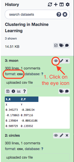
Our objective is to group the flowers into similar categories. To do that look for sklearn’s repository for the same.
Tools' Execution
Hierarchical Clustering
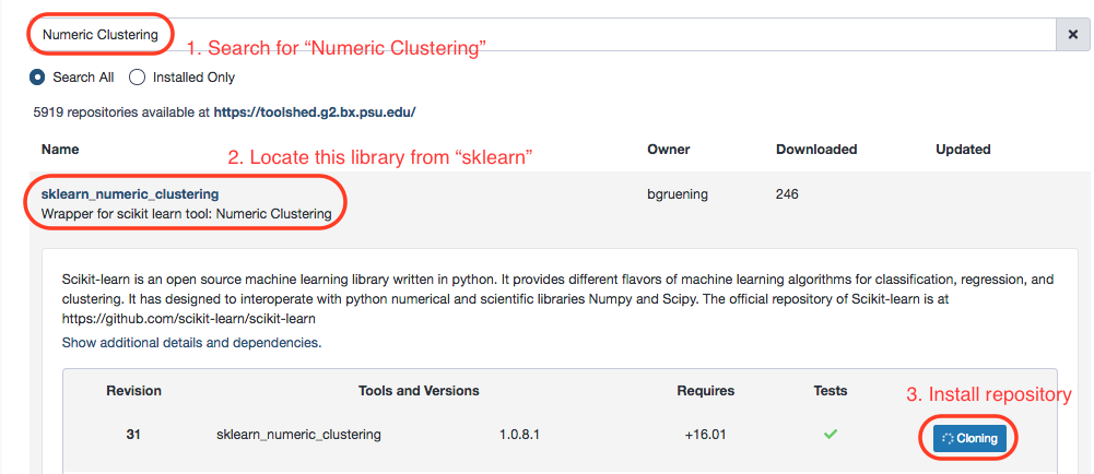
Make the following choices.
- “Select the format of input data”: Tabular Format (tabular,txt)
- “Data file with numeric values”: iris
- “Does the dataset contain header”: Yes
- “Choose how to select data by column”: All columns EXCLUDING some by column header name(s)
- “Type header name(s)”: Species
- “Clustering Algorithm”: Hierarchical Agglomerative Clustering - In “Advanced options”
- “Number of clusters”: 2
- “Affinity”: Euclidean
- “Linkage”: ward
After the successful run, rename the resulting dataset.

Next is the time to visualize the results. We shall use the Scatterplot with ggplot2 tool in the ggplot2_point repository to do this. Understandably, we will be able to see distinct clusters of data, i.e. different categories of flowers. Install and execute the tool with the following options.
- “Input tabular dataset”: Hierarchical clustering
- “Column to plot on x-axis”: 1
- “Column to plot on y-axis”: 2
- “Plot title”: Hierarchical clustering in iris data
- “Label for x axis”: Sepal length
- “Label for y axis”: Sepal width - In “Advanced Options”:
- “Data point options”: User defined point options
- “relative size of points”: 2.0
- “Plotting multiple groups”: Plot multiple groups of data on one plot
- “column differentiating the different groups”: 6
- “Color schemes to differentiate your groups”: Set 2 - predefined color pallete - In “Output options”:
- “width of output”: 7.0
- “height of output”: 5.0
- “dpi of output”: 175.0
Visualize the resulting image.

There are three species listed in the dataset- setosa , versicolor , and virginica . When you look at the clustering results, you'll see that all the setosa samples are grouped in one cluster and two other species (versicolor and virginica) are grouped in another one. There are two clusters in the figure, and it becomes obvious that versicolor and virginica are more similar to each other, being marked in the same cluster (0: green). ( Note: 0 and 1 are cluster labels .)
K-means Clustering
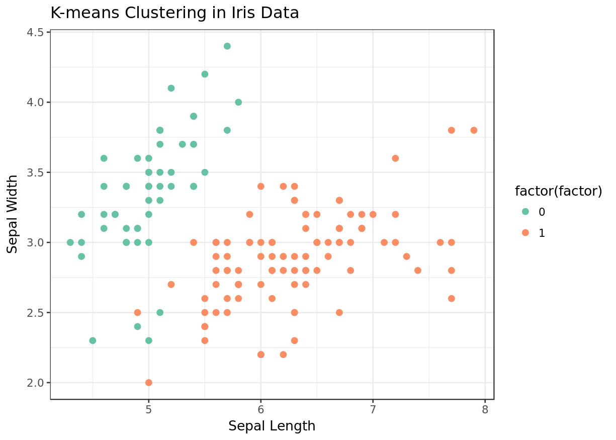
K-means clustering is a way of partitioning data into 'k' clusters, where k is a defined by the user, aprori. Each of the k-clusters is represented by a central value that is the mean of the data points within that cluster. More information can be found here .
Moving ahead, we’re going to execute the same protocol as above, now with k-means clustering algorithm. Make the following choices with the Numeric Clustering tool again.
- Select the format of input data”: Tabular Format (tabular, txt)
- “Data file with numeric values”: iris
- “Does the dataset contain header”: Yes
- “Choose how to select data by column”: All columns EXCLUDING some by column header name(s)
- “Type header name(s)”: Species
- “Clustering Algorithm”: KMeans - In “Advanced options”
- “Number of clusters”: 2
For convenience, we'll rename the results as k-means clustering . Next, same as before, we'll plot the resulting data table with ggplot2.
The paramter readings are as under.
- “Input tabular dataset”: k-means clustering
- “Column to plot on x-axis”: 1
- “Column to plot on y-axis”: 2
- “Plot title”: K-means clustering in iris data
- “Label for x axis”: Sepal length
- “Label for y axis”: Sepal width - In “Advanced Options”:
- “Data point options”: User defined point options
- “relative size of points”: 2.0
- “Plotting multiple groups”: Plot multiple groups of data on one plot
- “column differentiating the different groups”: 6
- “Color schemes to differentiate your groups”: Set 2 - predefined color pallete - In “Output options”:
- “width of output”: 7.0
- “height of output”: 5.0
- “dpi of output”: 175.0
Exercise
- How to find optimum value for k in k-means clustering?
- What is the difference between k-means and hierarchical clustering?
DBSCAN Clustering
Executing the tool.
- Select the format of input data”: Tabular Format (tabular,txt)
- “Data file with numeric values”: iris
- “Does the dataset contain header”: Yes
- “Choose how to select data by column”: All columns EXCLUDING some by column header name(s)
- “Type header name(s)”: Species
- “Clustering Algorithm”: DBSCAN
Visualizing results.
- “Input tabular dataset”: DBSCAN clustering
- “Column to plot on x-axis”: 1
- “Column to plot on y-axis”: 2
- “Plot title”: DBSCAN clustering in iris data
- “Label for x axis”: Sepal length
- “Label for y axis”: Sepal width - In “Advanced Options”:
- “Data point options”: User defined point options
- “relative size of points”: 2.0
- “Plotting multiple groups”: Plot multiple groups of data on one plot
- “column differentiating the different groups”: 6
- “Color schemes to differentiate your groups”: Set 2 - predefined color pallete - In “Output options”:
- “width of output”: 7.0
- “height of output”: 5.0
- “dpi of output”: 175.0
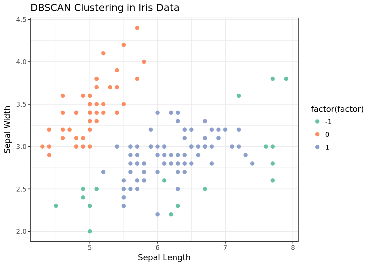
We see that unlike k-means and hierarchical clustering, DBSCAN was able to find all three species. We had pre-specified the number of clusters in the former two executions.
All results together, for perspective.
|
|
|
|
|---|
Exercise
- There is a concept of a silhouette coefficient to evaluate the clustering results. Can you explore the veracity of these results?
Applying Clustering on Multiple Datasets
Data Visualization
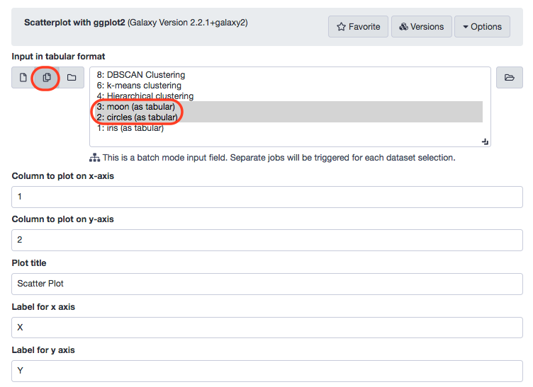
Just like before, the regression analysis can be scaled to multiple datasets taken simultaneously. Let us include the "moon" and "circles" datasets (imported before) for this module.
|
|
|
|---|
Cluster Data Visualization
We'l resort back to the Numeric clustering tool and process the algorithm with the parameters defined in the following screenshot.
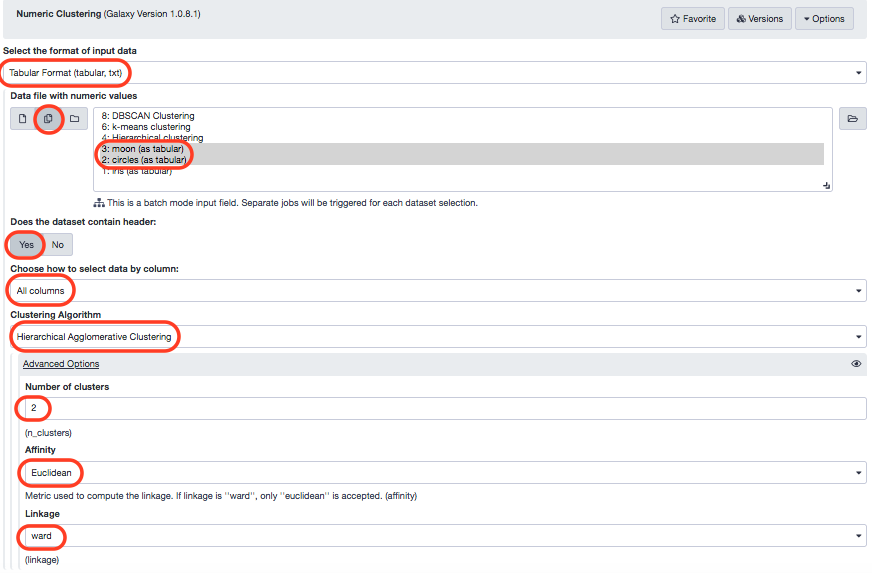
Again, we visualize these results.
- “Input tabular dataset” : Numeric Clustering on circles and Numerical Clustering on moon as multiple datasets
- “Column to plot on x-axis” : 1
- “Column to plot on y-axis” : 2
- “Plot title” : Hierarchical clustering
- “Label for x axis” : X
- “Label for y axis” : Y - In “Advanced Options”:
- “Data point options” : User defined point options
- “relative size of points” : 2.0
- “Plotting multiple groups” : Plot multiple groups of data on one plot
- “column differentiating the different groups” : 3
- “Color schemes to differentiate your groups” : Set 2 - predefined color pallete - In “Output options”:
- “width of output” : 7.0
- “height of output” : 5.0
- “dpi of output” : 175.0
|
|
|
|---|
Exercise
- You can apply the other two algorithms (k-means and DBSCAN) to moon and circles datasets in the same way as explained above. In the k-means algorithm, please use k=2 and for the DBSCAN algorithm, the parameters should not be the default ones as used earlier. They should be set as follows:
- for the circles dataset (maximum neighborhood distance=0.2 and minimal core point density=5), and
- for the moon dataset (maximum neighborhood distance=0.3 and minimal core point density=4).
References
- Xu, D., Tian, Y. A Comprehensive Survey of Clustering Algorithms. Ann. Data. Sci. 2, 165–193 (2015). https://doi.org/10.1007/s40745-015-0040-1
